Sunday, August 2, 2009

Process..


1. Create a new layer and paint the whole background black.

2. Type the word, SMOKE in 'Small Fonts' font, 144 pt.
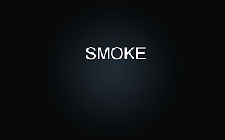


3. Set the background layer as gradient overlay. It's under layer, layer style.
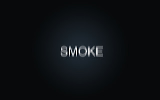


4. Go to blur, motion blur and set the angle to 90 degrees and the pixel distance to 40.
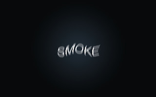


5. go to filter, distort and wave and set 3 for the Number of Generators, 10 and 346 for the Wavelength, and 5 and 35 for the Amplitude
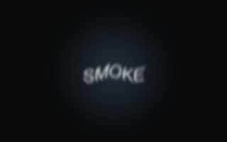


6. Gaussian blur, set it to 10 degree. and group the text and background layer.
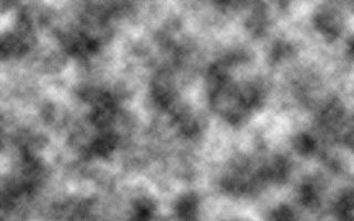


7. Create a new layer and put it on top of all the layers and choose the clouds effect that is under filter, render.


8. Change the blend mode to color dodge.
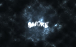


9. Go to layer, layer mask, and reveal all.
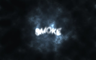


10. Use a soft brush to cover up some parts of the clouds. Lower the brush opacity first.
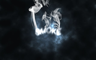


11. I downloaded the brush set from http://qbrushes.com/photoshop-abstract-brushes/smoke-brushes/ and created a new layer with the color setting to color dodge. And using the brushes I downloaded, I decorated the word to make it look like the word is smoking.
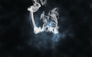


12.Add a new layer, put it behind all the layers except the background layer, and paint the new layer black. And go to filter, texture, texturizer and set the scaling 100% and 4 for the Relief. For the Texture use Canvas and for the light, use Top. And set the opacity to 10%.


I like how the image looks at this point, but to finish the tutorial,


13. Choose invert from Layer, New Adjustment Layer.


Final interpretation


Final study


These are two versions of a study I did for the final. First I wrote the word, smoke, used gaussian blur to blur the word and the motion blur to make the letters look distorted. And I downloaded the set of smoke brush tools like the tutorial said to and used it to create the smoke effect above the word, then I rendered the cloud in the background and covered up some parts of the cloud with soft black brush. For the white version of this, I inverted the whole image. I really like the smoke brush tools.
I thought I could do more than one study, but I have some visitors from Korea at home, so I didn't do as much as I thought I could.
But I'm very satisfied with my final interpretaion.

Thursday, July 30, 2009

Ice cream_better


I added a wood grain texture in front of it. I like it better than the noise effect.

Final week

Before this course, I would have a design in mind, but couldn't figure out how to create it in Photoshop or Illustrator, so often times they would turn out completely different from what I had in mind in the beginning, like the baby image. Now I feel a little more comfortable with some tools in Photoshop.
I've only watched some tutorials on Blackboard, so I need to continue to watch them, do studies and interpretations on my own and post them. I'll probably use the same blog account..But for this week, I found a website that has Photoshop tutorials that could be useful if I learned for some classes I am taking next this year. I'm especially interested in the text effect tutorials.

http://abduzeedo.com/